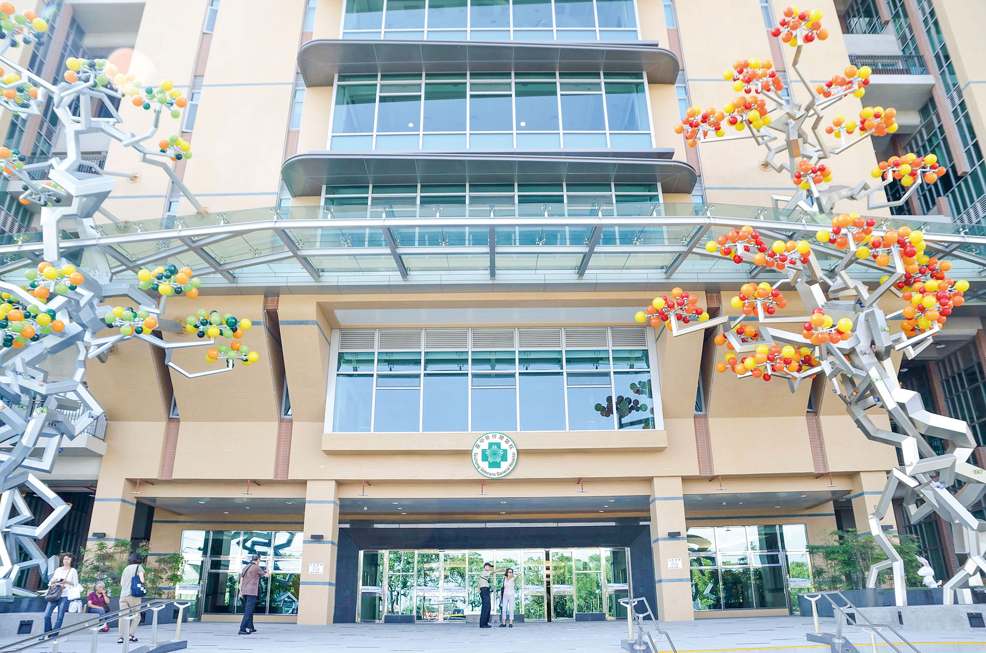
臺中榮民總醫院
Taichung Veterans General Hospital
嶄新的LOGO設計以心型代表中榮以人為中「心」的愛心醫療照顧,隨數位光點四射象徵邁向智能化醫院之展望,五光芒代表專業、安全、教學、研究、責任五項核心。指標系統規劃講究字體大小、標示醒目、色彩分別、視覺高度等,通用性與美感的融合是此案的重點。設計團隊進行不同以往的色彩嘗試,擺脫傳統印象,呈現活力氛圍。各樓層使用色彩分區,空間內無過多顏色,尋找目的地不再是挑戰迷宮。
A heart-shaped design for the brand-new Logo represents the center of medical care of Taichung Veterans General Hospitals, and the radiant rays of digital dots symbolize the vision towards a modern smart hospital. These five rays serve as five core aspects for professionalism, safety, education, research, and responsibility. The wayfinding system demonstrates an aesthetic integration of universal design via emphasis on legible font size, eye-catching signs, color distinction, appropriate sight level, and more. By avoiding traditional color customs, we carry out different color experiments in order to present a clean and vibrant atmosphere for each floor. Since then, finding the destination is no longer a maze challenge.
Client
臺中榮民總醫院
Year
2016
Services
品牌 Branding 、指標 Wayfinding
