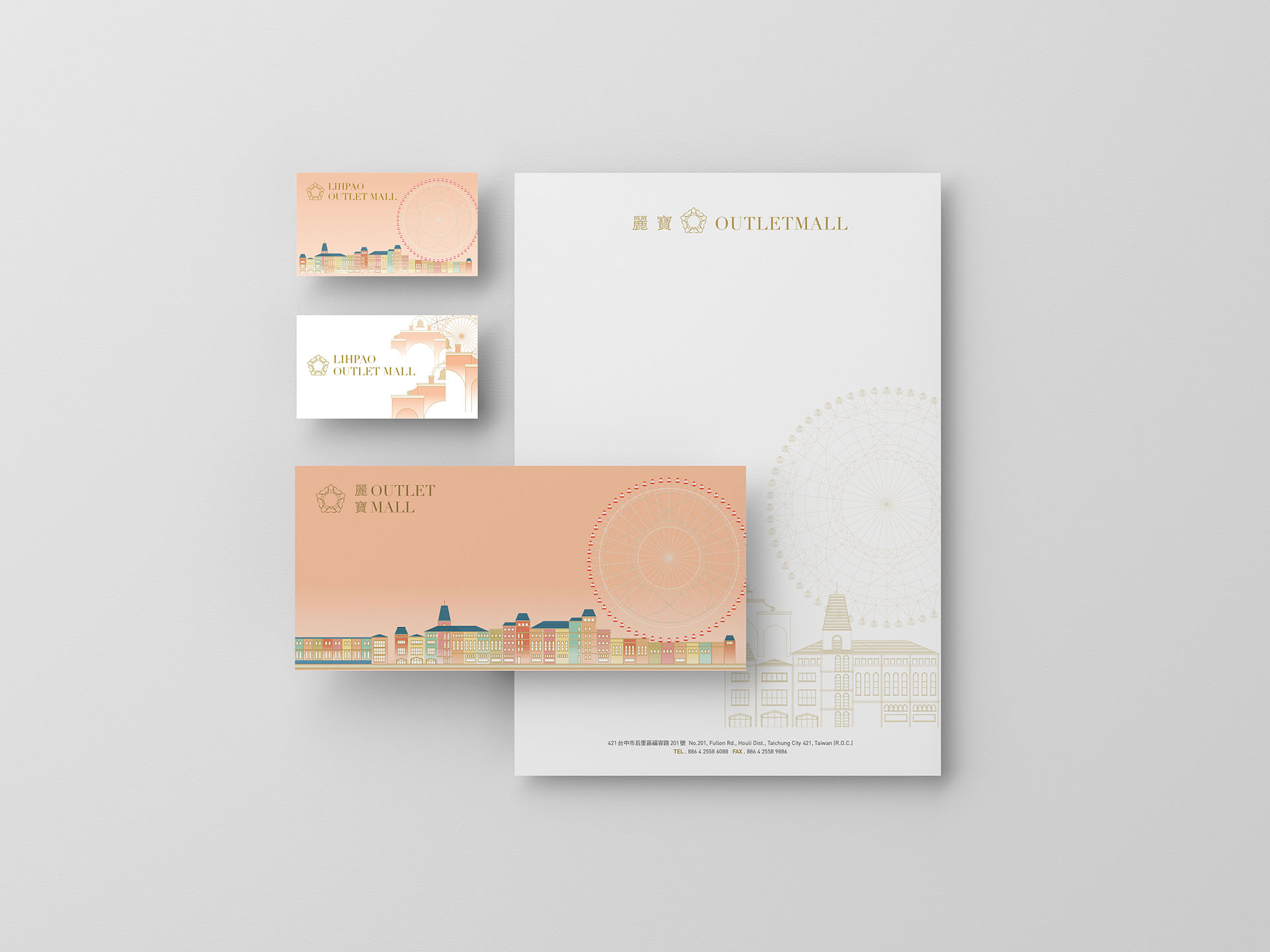
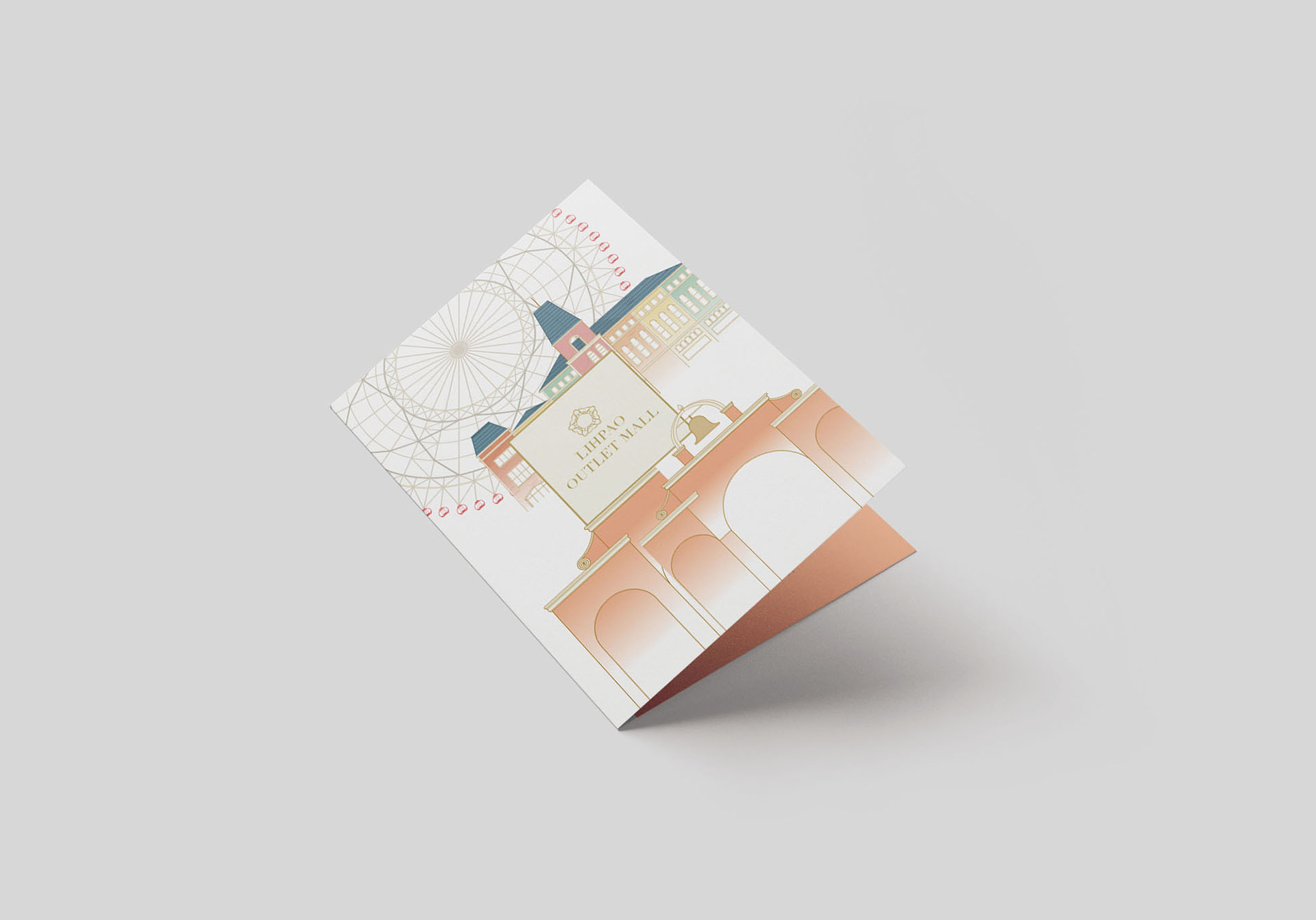
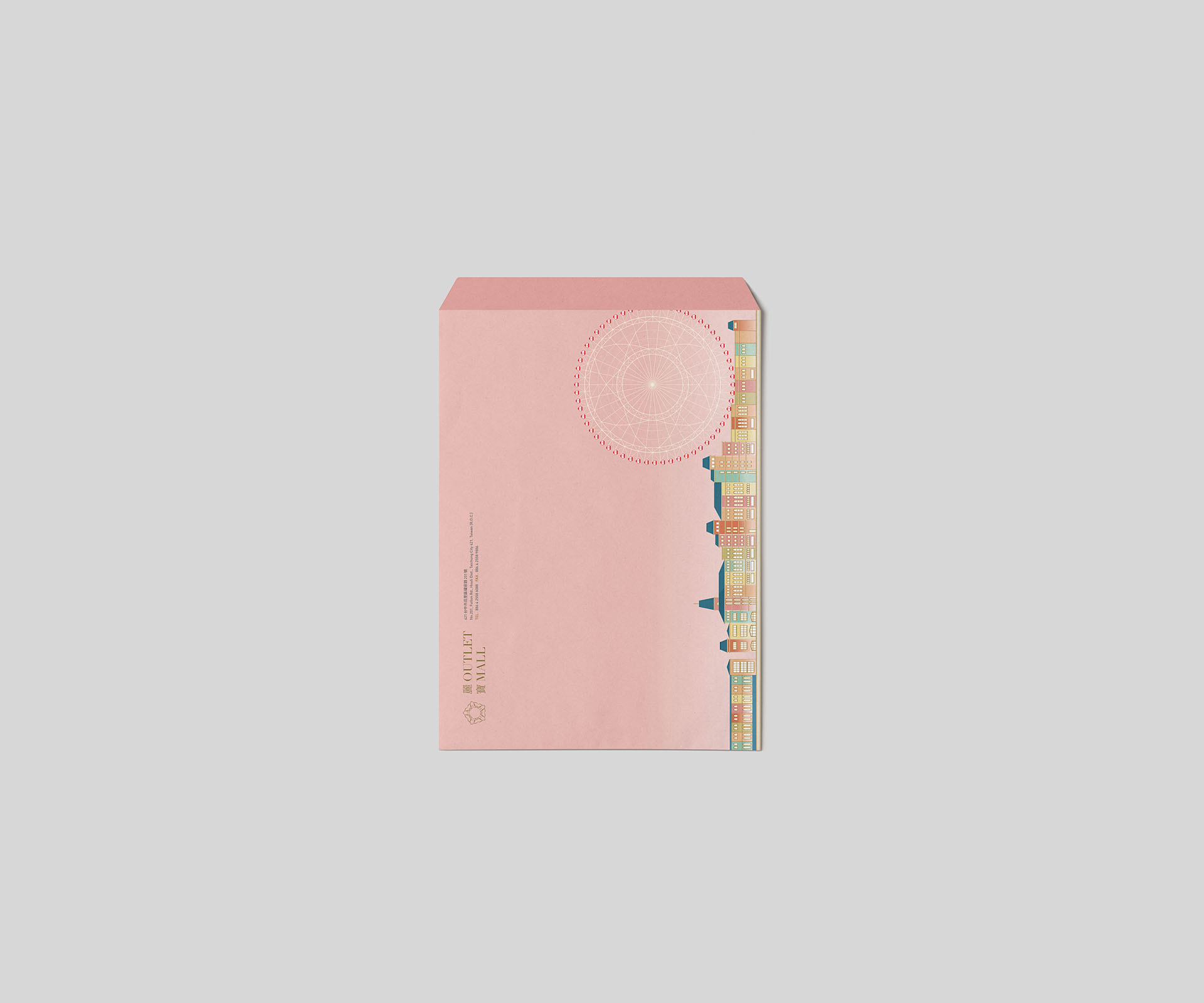
The logo takes the "L" from LIHPAO OUTLET in the style of smooth ornamental lines to show fine and elegant characteristics. The ring of repeated "L" is woven into the image of diamonds, shining brilliantly, symbolizing the focus of attention.
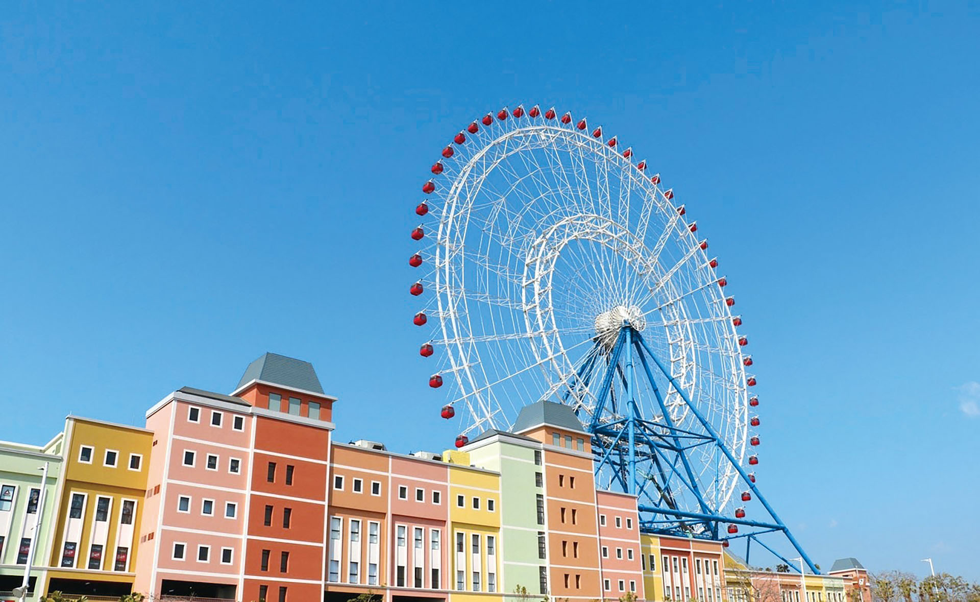
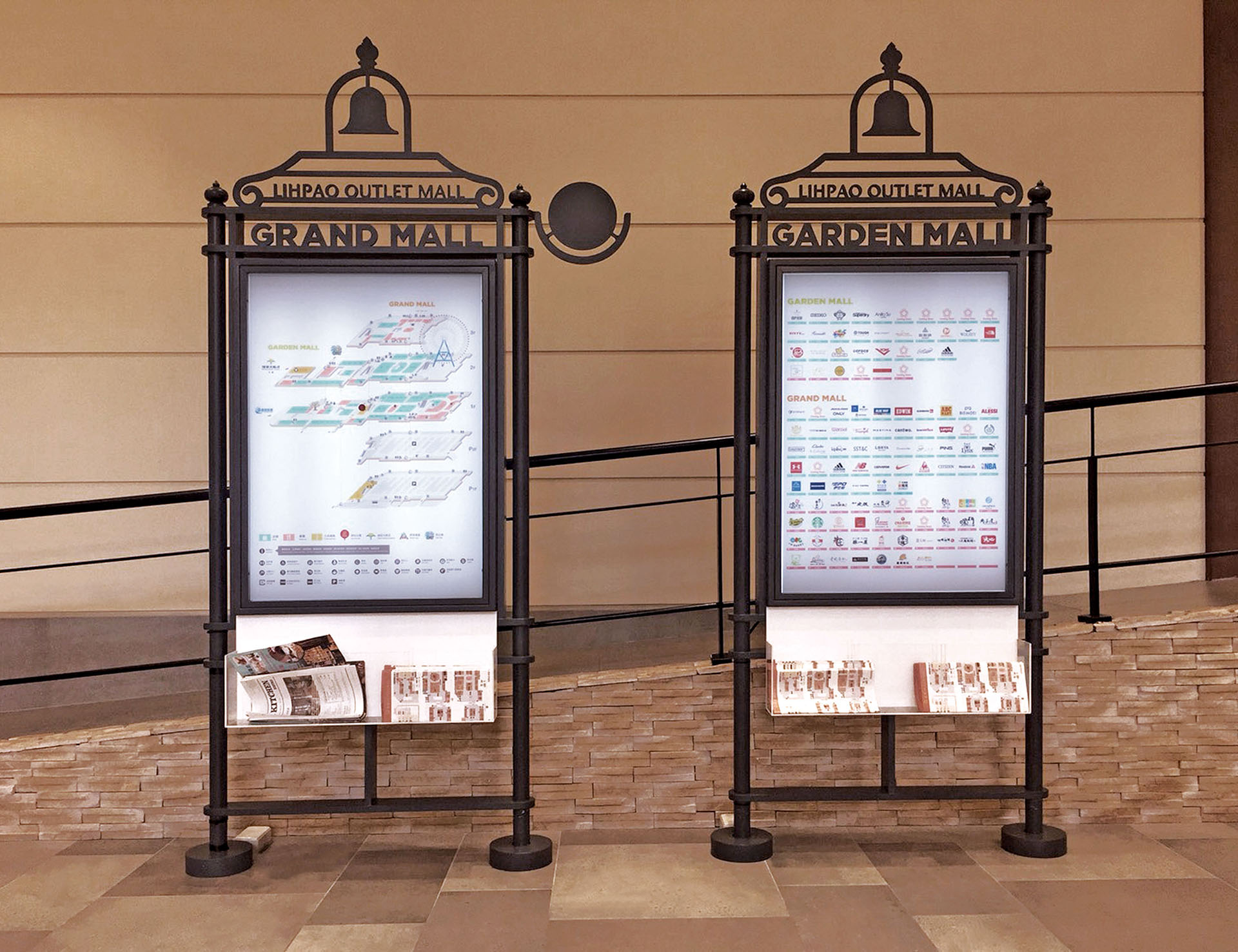
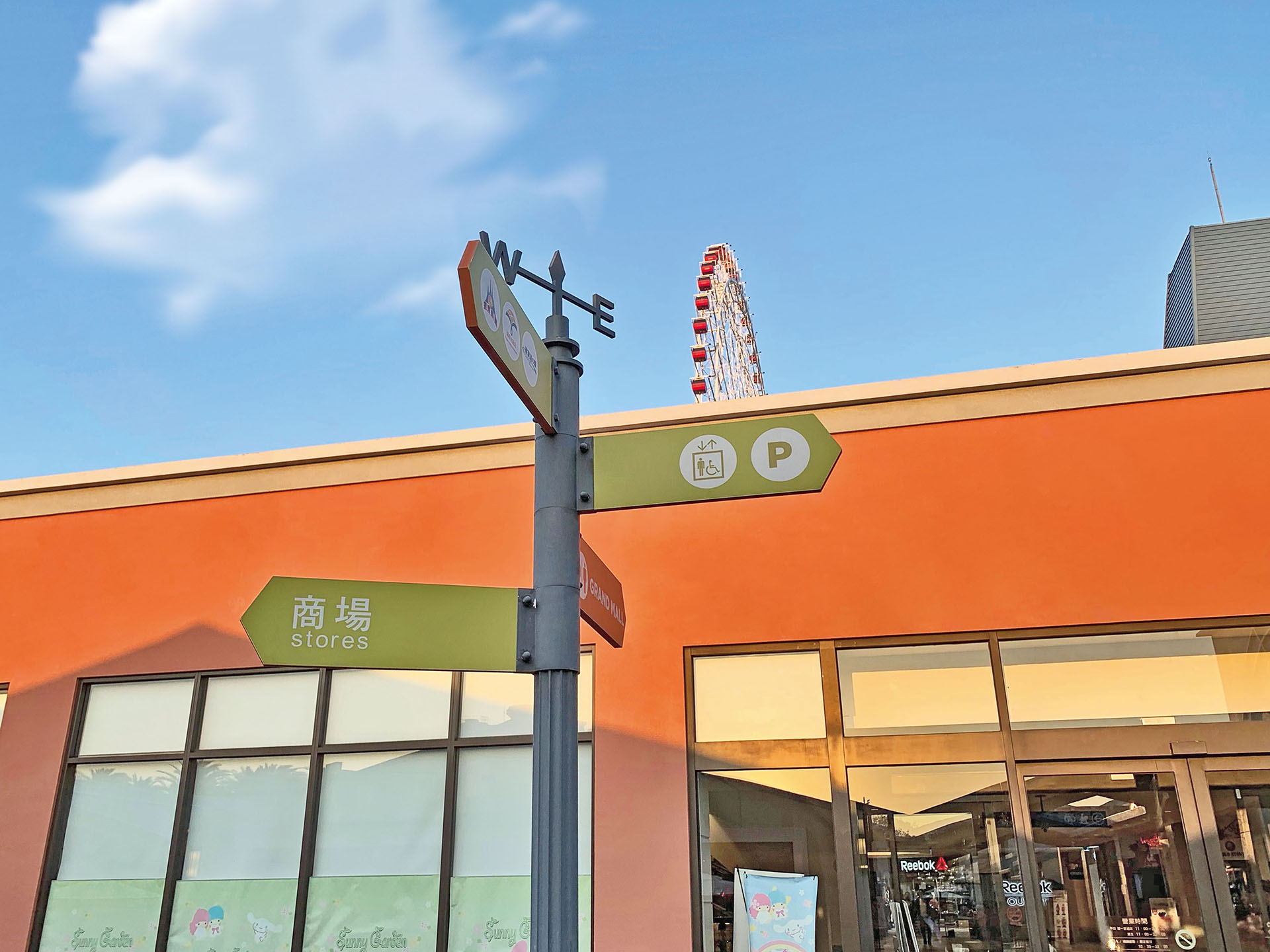
Following the wayfinding design specifications and sign samples proposed by Mr. Teruhisa Matsumoto, the artistic director of Japan's RIC Design Inc. for this shopping mall, Fontana executes the on-site wayfinding implementation design and discusses closely with Mr. Matsumoto. Whether the neat cast irons in fine craftsmanship of the European-style carved signboard or the choice of warm colors to match the mall environment, Fontana’s execution is in line with Mr. Matsumoto’s expectations, creating a warm atmosphere and making the shopping experience unforgettable.