星野虹夕諾雅谷關溫泉渡假村
HOSHINOYA Guguan
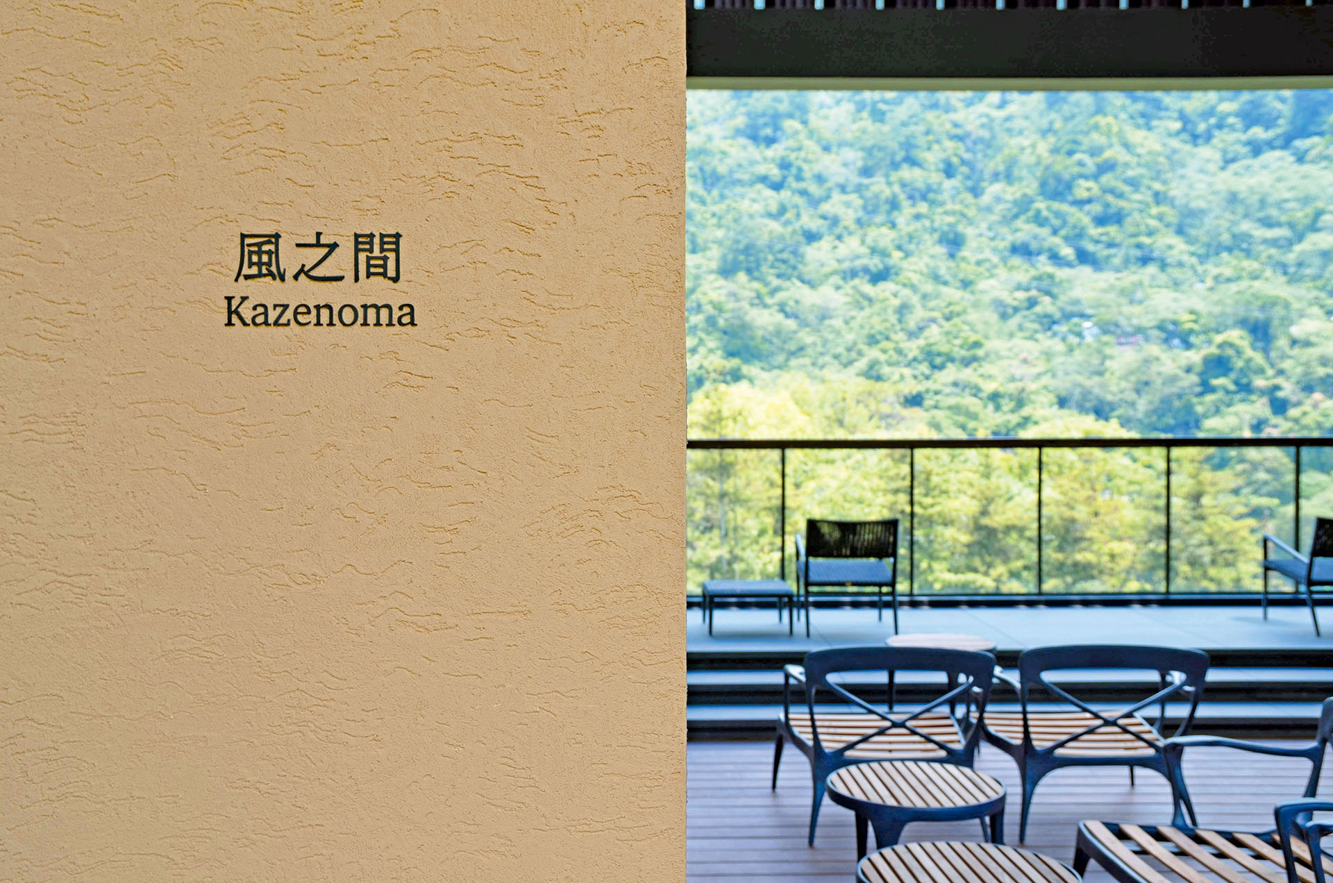
無論設計或製作都依循日本星野集團嚴格與謹慎的要求,飯店指標以極簡設計融入環境並延伸空間感、不喧賓奪主,襯托大自然的美。標示使用高質感立體字,由經驗老道的師父,一筆一畫仔細地黏貼至不同工法的牆面,兼具高識別性且能營造安穩、靜謐的氛圍。
Whether design or implementation follow the very strict and cautious requirements of the Japanese Hoshinoya Group. This hotel orientation system takes the site environment into consideration and presents with minimalist design an extension of spacious sense, not overwhelming to the guests, but setting off the beauty of nature. All signages are made of high-quality 3D letter characters and carefully pasted by experienced masters stroke by stroke to walls that are treated with different construction methods. As a result, the wayfinding system of this resort is highly recognizable, furthermore creates a stable and quiet atmosphere to everyone's astonishment.
Client
星野虹夕諾雅谷關溫泉渡假村
Year
2019
Services
飯店 Hotels、指標 Wayfinding
