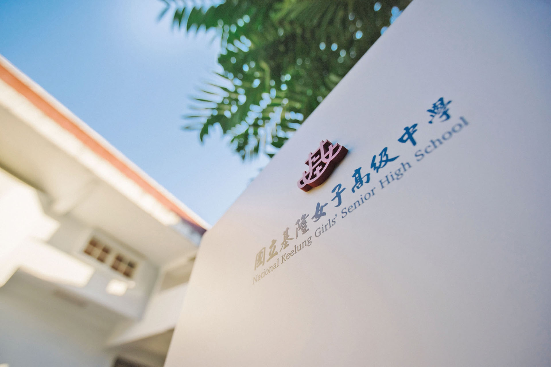
學美.美學 國立基隆女子高級中學
National Keelung Girls' Senior High School
指標規劃設計靈感來自於鄭愁予描繪基隆海景的《如霧起時》,揣摩現代詩作「情與景,意與象」的疊加和虛實轉幻的糅合技法,形塑出「撇見一抹紅.凝視基隆女中」的設計概念。
團隊在設計基隆女中的環境視覺指標系統,將校園建築上的紅潤白紋,猶如活力的底蘊,珍藏在現代簡約的視覺造形中,嘗試在詩性的「景、象」上,建構出一個「情、意」並含的友善校園,讓訪客自然快速的找尋方位。
設計重點為一重塑學校形象:將設計思維與減法設計帶入校園、二指標國際化:中英對照引導資訊,神社區更是加入日文和符合舊址文化呼應之色彩識別,方便朝聖的外國朋友易找尋神社舊址,緬懷親人在台的情形、三地圖立體化:將平面配置圖立體化呈現地勢高低落差37公尺的實際狀況。
透過系統化設計,無論南北校區或是在百年神社舊址的標牌,皆能引領使用者穿梭歷史傳統與當代時空,藉由新舊輝映的表現形式,宣揚傳承百年的高校精神。
Design concept “Seeing a touch of red-Gazing at National Keelung Girls' Senior High School” is inspired from the poem “Port of Mists”, a depiction of Keelung’s seascape by the legendary Taiwanese poet Zheng Chou-Yu. Reflecting on Master Zheng’s techniques of “feeling vs. scenery, meaning vs. image”, this project incarnates a new poem in a wayfinding system, which turns spiritual features from the girls’ school into real signages, guiding users between historical tradition and contemporary time.
With a glance at red and white hues on the campus buildings, the design team cherish a power of vitality in the environment and attempt to reinterpret the poetic “feeling, meaning” via “scenery and image” by creating a user friendly wayfinding system on campus, in order to guide visitors to find directions successfully.
Design highlights include 1. Reshaping school image: introducing design thinking of subtractive design onto campus; 2. Internationalizing wayfinding language: the basic guide information is a Chinese-English dual lingual system. A new language Japanese, plus a culture-echoing color identity, is added to enhance the shrine area guidance, subtly for foreign pilgrims easily to find their way and cherish the memory of their loved ones; 3. The three-dimensional map: a 2D map upgraded into three-dimensional layout of site plan shows relative conditions of the actual topography with a height difference of 37 meters.
Whether it is the signage on the north, south campus, or the centuries-old shrine site, a systematic wayfinding design can guide users between historical tradition and contemporary time, thus integrating rich expressions within an aesthetic environment nourishing old and new.
Client
國立基隆女子高級中學
Year
2020
Services
指標 Wayfinding
